
Designing the AFRICSIS Logo
- David Dunn
- Aug 2, 2019
- 3 min read
The African Centre for Science and International Security (AFRICSIS) was founded by Hubert Foy, who wanted to use his expertise in space and nuclear science to develop smart and effective security policies in Africa. I met Mr. Foy (electronically) through one of my courses at the University of Tennessee.
In "Special Topics in Rhetoric: Global Communication in Science, Technology and Policy" groups of students were paired with international organizations to assist with documents, graphics, or any other communications that required an editor or content creator. My group was paired with AFRICSIS to edit documents and update branding.
While their website features bright detailed imagery, AFRICSIS used a simpler logo for documents. Though the old logo was professional, it was not as eye-catching and memorable as it needed to be. With a couple of years' experience in Adobe Creative Cloud under my belt, I was assigned to work on a new document logo.
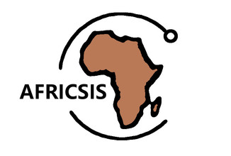
Phase 0 - Original Logo

The process began with an examination of the original AFRICSIS document logo. This logo, a stripped-down version of the color graphic on the website's header, was used in official documents produced by the organization. The logo is brown, with the African continent partially encircled and the organization's name to the right of the graphic.
Phase 1 - Atomic Continent, Overlapping "i" Particle, Subtle Particle


Based on the original design, and Mr. Foy's instruction that the logo needed to have an atomic element, I developed three drafts. As a student, it was my first time designing a logo, and the attempts were far from what would become the final product.
Phase 2 - Light Blue African Continent with Atomic Orbitals


Upon receiving my designs, Mr. Foy sent them to about one hundred of his closest friends and included a survey on the email. The resulting feedback helped us develop the new design and sent me on a crash course in branding. Over the next forty-eight hours I worked around the clock developing new drafts and bouncing ideas off of Mr. Foy. The critical feedback points that impacted the design the most were as follows:
Get rid of the outlines on shapes. They make the designs look like clip art.
Use blue as the primary color and simplify the color scheme.
Don't be subtle about the atomic element. The subtle designs aren't resonating.
Set up the logo in a way that makes the audience read the name of the organization.
Phase 3 - Penultimate Draft

While Mr. Foy's small army of friends can take most of the credit for the final graphic, I will take credit for one embellishment in the design. From the beginning of the project, I liked the idea of the dot of the "i" in AFRICSIS being an electron. Toward the end of revisions, I realized a way I could visually tie together the logo and organization name using my original particle design idea. Mr. Foy was happy with the final graphic, and one addition was made to the design.
Phase 4 - Final Design

In the logo's final iteration, the full name of AFRICSIS is displayed in magenta beside the graphic with a black column line in between. This achieves two rhetorical objectives simultaneously: the catchy visual of the graphic imagery helps the viewer remember the organization, while right side reminds the viewer what AFRICSIS stands for as both an acronym and as an organization.
AFRICSIS used the design on an official document that they co-developed soon after the project was complete, and now you can see the official logo in use in the Executive Summary of AFRICSIS. I succeeded in my first attempt to design an organization's logo, and the process taught me valuable lessons in graphic design and communications.
Mr. Hubert Foy graciously provided consultation for this article.
I would also like to thank Dr. Russel Hirst for developing and instructing the “Special Topics” course that facilitated this project.